

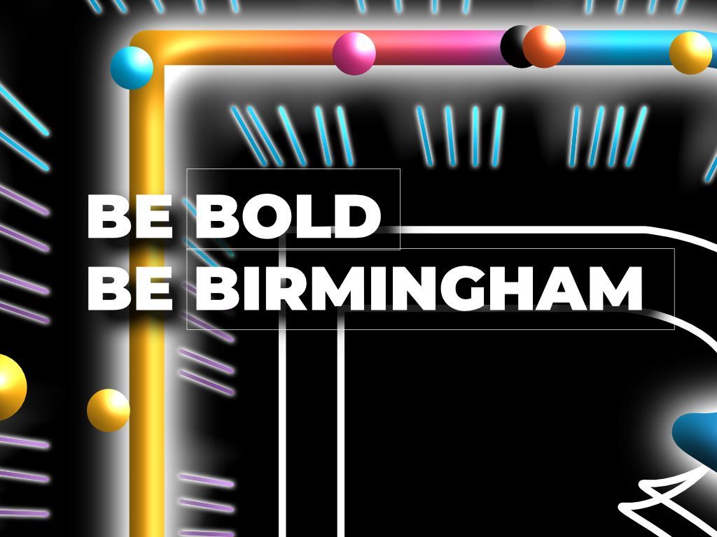
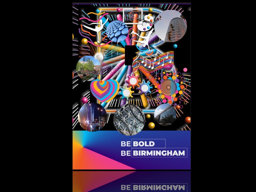
Be Bold Be Birmingham creative competition entry

The project shown on this page is a competition entry for Birmingham city council of a visual interpretation of the tagline Be bold Be Birmingham
Background
The aim of the concept is to embrace Birmingham as a showcase city to the world with unique features and identity.
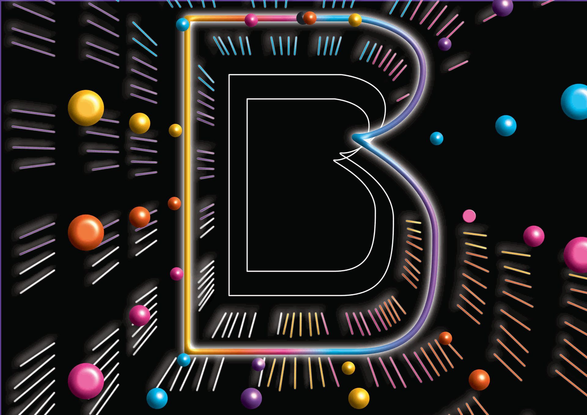
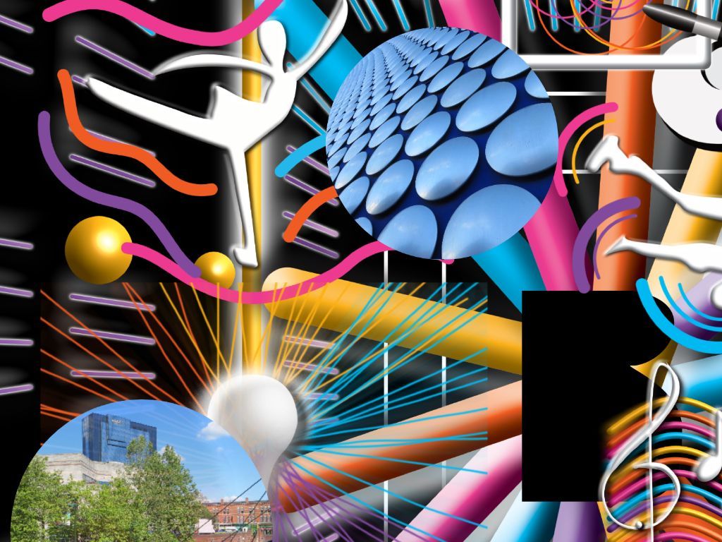
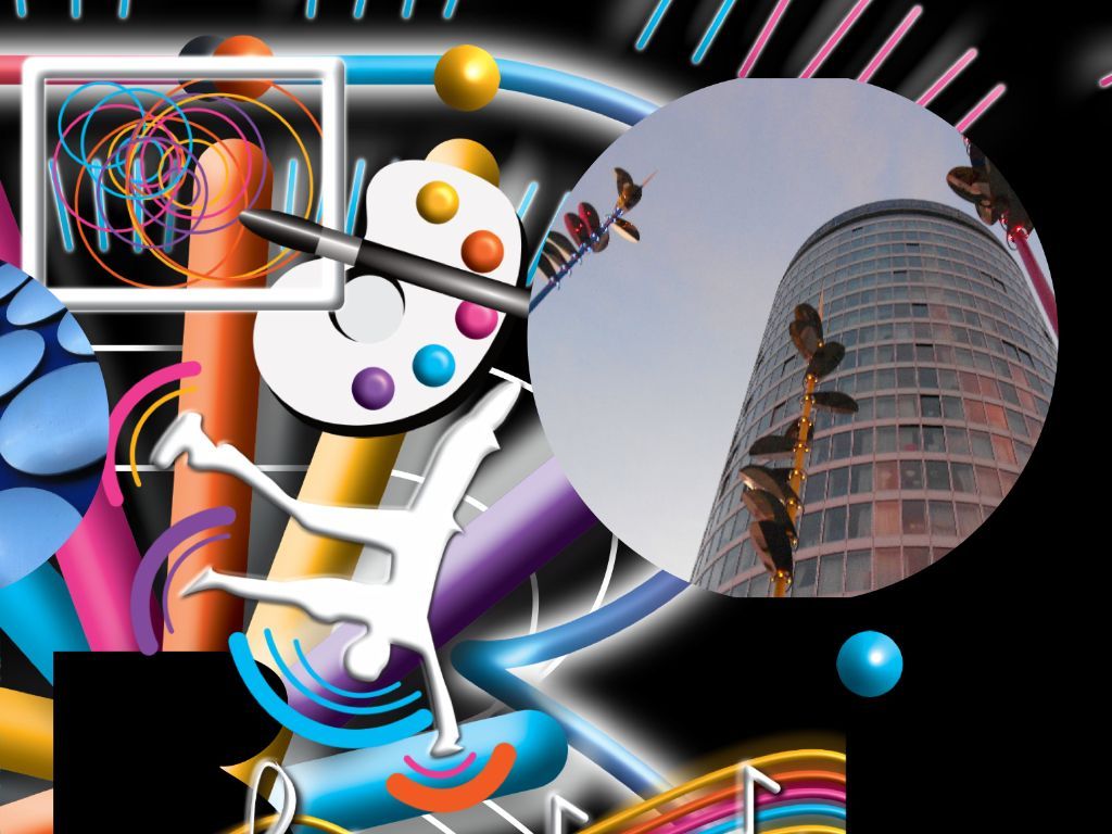
In creating the project accommodation of visual imagery of a large "B" shape and several elements. This includes cultural and unique elements, visual representation and showcase visual effects.
Cultural and unique elements
This focuses on the unique identity of the city and includes many examples including art, music, dancing, industries and innovation.
Visual representation
This includes images of the location of the city including the rotunda, brindleyplace and the library of Birmingham.
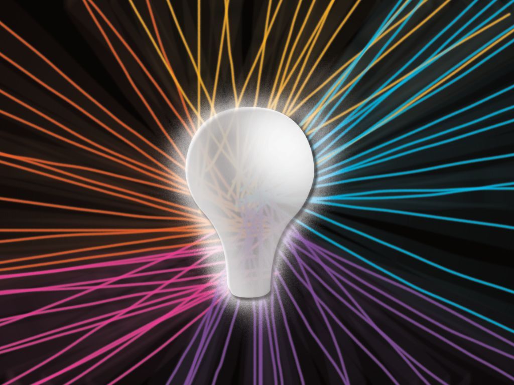
Showcase effects
The visual effects including shapes and patterns misinterpret neon tubes and light bulbs providing the showcase interpretation
My approach
My approach was to have a different approach to boldness. I felt it was much more than shouting block capitals in how standards marketing is presented. Instead, the boldness is related to the visual identity of the concept which draws you in and that is the factor I use throughout this project
The concept is a combination of strong visual effects and long with specific visual images that represent the city. This involves building individual elements separately before constructing the visual environment than adding the Showcase is your sense of me onto the lightbulb using neon visual effects. This concludes in modifying the colour palettes to the requirements of the "Be Bold Be Birmingham" presentation and Birmingham's commonwealth games.
The requirement is to present within an A4 poster format. However, the composite can be adaptable to any format and platform when required.

My insight
This was a very challenging project with developing a concept very quickly and within a short amount of days. This was because I was only aware of the competition a few days before the entry deadline.
Background
However, I wanted to present something different from the standard techniques and styles used for bold marketing and promotion.
This led to creating visual concepts to be the focal point which will draw the audience.
Preparation
I need to explore what aspects are needed for the projects and the message behind the design. So I brainstorm visual elements around the city identity, visual elements and showcase effects.
The design visuals started with the visual environment which represents the showcase element. However, I wanted to be specific so I decided on visual effects around the abstract large letter b shape with visual elements inside the letter shape.
Secondly, I start to visualise the cultural identity including art, music, dancing, industries and innovation. Each example was created separately before adding each artwork to the main design area.
Secondary I develop the showcase aspects using a series of neon tube shapes and circle light bulbs in the main design area.
Finally, add visual images of selected landmarks and iconic places of the city. However, the I did must not be historic to emphasize the bold message.
In the complete design, the colours used were modified to specific colour guidelines. This is associated with the corporate colour scheme for the commonwealth games for Birmingham and the marketing initiatives by Birmingham City Council
The design is complete in a colour blend with the "Be Bold Be Birmingham" title displayed within the colour bend shape.
The overall aim is to emphasise a showcase world-class city with a strong and unique local identity. As result, the showcase is the visual interpretation of the boldness of this project.
This project is linked with


The access webpage will be available soon